
Client
Reverb.com
Type of Project
Behavioral Design & Systems Design
My Role
Strategist & Lead Designer
Hey, asking for a friend...
How do you let a seller know their stuff might not be worth as much as they think?
The friend is Reverb. Reverb had a very pressing, and delicate problem.

...but who even decides what's considered "overpriced" or not?
The marketplace does.

And with so many years of markeplace records...
Reverb knows what's likely to sell. Why not let the sellers know too?
Every listing's different, but the marketplace had gotten bloated with a lot of stuff that was never going to find a buyer.
And so we had our...
Hypothesis:
Leveraging Reverb's historical pricing data to provide dynamic feedback in the listing process will better educate sellers, leading to better priced listings entering the marketplace.

A summary of the project's visual progression
As design progressed...
I found the most value in iterating on three key elements.
Some of Reverb's product and design guidelines were very not-set-in-stone, and this was an opportunity to inform some of those longer-term decisions.
Color
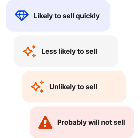
Our team had just recently introduced a refreshed brand palette, but rules around using them as sentiment colors were largely non-existent.

Iconography
Many of our icons used lacked canonical documentation. I put a stake in the ground for the sparkle icon during this experiment, its role being a signifier for "smart" or "AI-like" expressions of Reverb's uniquely informed recommendations.

Language
Reverb had historically only focused on how quickly a listing would sell. This time, we decided to write more plainly (and assertively) about whether their listing will sell at all.
The experiment was a huge success.
Prices went down. Sales went up. What's better than that?
Learnings might be, depending on who you ask.
Impact
Related Project
I led an ideation session that directly preceded this project, give it a look.